Landing Page (index.php)
Overview
The landing page serves as the main entry point for the KKU BIO application, providing a modern and responsive interface for users to create their personal bio links.
Features
Navigation
- Clean, responsive navigation bar
- Mobile-friendly menu
- Quick access to login and signup
- Features and FAQ links
Main Components
Header Section
- Meta tags for SEO optimization
- Social media meta tags
- Favicon and mobile app icons
- Responsive design elements
Hero Section
Main Call-to-Action
- Prominent headline: "Launch your site in seconds"
- Username registration form
- Custom URL creation (profile.medbots.tech/yourname)
Features Preview
- Showcase of key features
- Visual demonstrations
- Free tier promotion
User Interface Elements
Navigation Bar
html
<div class="nav-smooth">
  - Logo/Brand
  - Features link
  - FAQ link
  - Login button
  - Sign up button
  - Mobile menu toggle
</div>
URL Creation Form
html
<form action="register.php" method="get">
  - URL prefix (profile.medbots.tech/)
  - Username input field
  - "Claim my link" button
  - Free tier message
</form>
Technical Features
Meta Tags
- Character encoding (UTF-8)
- Viewport settings
- SEO meta tags
- Social media cards
- Mobile app configuration
Responsive Design
- Mobile-first approach
- Breakpoint handling
- Flexible layouts
- Dynamic content sizing
Performance Optimizations
- CSS optimization
- Image optimization
- Responsive loading
- Performance-focused classes
Design Elements
Typography
- Font sizes: 14px to 96px
- Font weights: Regular to Semibold
- Responsive text scaling
- Custom tracking and leading
Colors
- Primary brand colors
- Gradient text effects
- Background variations
- Hover state colors
Layout
- Grid system
- Flexbox layouts
- Responsive containers
- Spacing system
Integration Points
Authentication Flow
- Links to login.php
- Links to register.php
- Session handling
- User state management
Navigation System
- Internal page routing
- External link handling
- Mobile menu functionality
- Smooth scrolling
Best Practices
SEO Optimization
- Meta descriptions
- Open Graph tags
- Twitter card support
- Canonical URLs
Accessibility
- Semantic HTML
- ARIA attributes
- Keyboard navigation
- Screen reader support
Mobile Responsiveness
- Viewport optimization
- Touch-friendly elements
- Mobile menu system
- Responsive images
Related Files
assets/css/home.css- Main stylingregister.php- Registration handlinglogin.php- Authenticationmanifest.json- PWA configuration
Landing Page Documentation
Overview
The landing page (index.php) serves as the main entry point for KKU BIO, featuring a modern, responsive design with a focus on user conversion and feature presentation.
Page Structure
1. Meta Information and SEO
html
<head>
    <title>KKU BIO: Launch Your Site in Seconds</title>
    <meta data-n-head="ssr" charset="utf-8">
    <meta data-n-head="ssr" name="viewport" content="width=device-width,initial-scale=1,maximum-scale=1,user-scalable=0">
    <meta data-n-head="ssr" name="description" content="A simple 'KKU BIO' for your socials. Designed for mobile, but packed with features for a complete website">
<meta data-n-head="ssr" property="og:title" content="KKU BIO: Launch Your Site in Seconds">- Comprehensive meta tags for SEO
- Social media sharing optimization
- Mobile viewport configuration
- Clear page description
2. Navigation Bar
html
<div class="fixed left-0 right-0 z-40 top-0 nav-smooth mt-10 pt-0-i">
    <div class="mx-8">
        <div class="flex relative mx-auto py-16 px-24 bg_landing width_large xl:w-1300p box-shadow w-full width_large mx-24">
            <div class="text-16 font-semibold mr-24 cursor-pointer self-center duration-200 hidden lg:block text-black hover:text-gray-600">Features</div>
            <div class="text-16 font-semibold mr-24 cursor-pointer self-center duration-200 hidden lg:block text-black hover:text-gray-600">FAQ</div>
            <div class="flex flex-grow flex-row-reverse">
                <a href="https://profile.medbots.tech/register.php" class="text-16 font-semibold leading-7 flex cursor-pointer bg-black rounded-full py-8 px-24 duration-200 lg:block text-white hover:bg-gray-800">
                    Sign up
                </a>
                <a href="https://profile.medbots.tech/login.php" class="text-16 font-semibold leading-7 mr-16 lg:mr-24 cursor-pointer self-center duration-200 lg:block text-black lg:hover:text-gray-600">
                    Log in
                </a>
            </div>
        </div>
    </div>
</div>
Key Features:
- Fixed position navigation
- Responsive design with mobile menu
- Clear call-to-action buttons
- Smooth hover transitions
- Mobile-friendly hamburger menu
3. Hero Section
html
<div class="duration-700 flex-col relative flex w-screen items-center justify-center opacity-100" style="height:80dvh">
    <div class="flex flex-col text-center mx-auto w-full lg:w-840p px-24 py-16 xs:pt-90 xs:pb-0 mt-40">
        <h1 class="w-720p md:w-480p text-96 font-semibold mb-24 heading_gradient tracking-tight self-center leading-100">
            Launch your site in seconds
        </h1>
Features:
- Full-screen hero section
- Gradient text styling
- Responsive typography
- Centered content layout
4. Username Input Form
html
<form action="register.php" method="get">
    <div class="flex input-main-wrap-create-home overflow-hidden rounded-md z-10 xs:text-14 xs:h-48 bl-bg">
        <div class="flex flex-col justify-center bg_landing">
            <div class="pl-24 xs:pl-12 font-semibold text-lg text-left leading-17 xs:text-14 text-blDark">
                profile.medbots.tech/
            </div>
        </div>
        <input name="link" placeholder="yourname" class="bl-input-create text-black font-semibold placeholder-grey text-14 sm:text-lg w-80 sm:w-150p bg_landing" required>
        <div class="cursor-pointer w-full flex items-center justify-center bg_trans">
            <button type="submit" class="font-semibold text-white w-125p sm:w-auto rounded-r-md px-24 xs:px-0">
                Claim my link
            </button>
        </div>
    </div>
</form>
Features:
- Custom URL preview
- Input validation
- Mobile-responsive design
- Clear call-to-action button
5. Features Section
html
<div class="relative w-screen z-2 pt-48 xs:mt-48">
    <div class="transition transform transition-all duration-500 ease opacity-100 translate-y-0">
        <h1 class="w-720p md:w-480p xs:w-400p mx-auto text-64 font-semibold my-48 xs:my-32 mt-128p text-center">
            Unmatchable features. <span class="text-gradient">Free, forever.</span>
        </h1>
    </div>
    <div class="grid grid-cols-2 ftr:grid-cols-1 gap-48 xs:gap-32 w-1000p ftr:w-full mx-auto">
        <!-- Feature cards go here -->
    </div>
</div>
Features:
- Grid layout for features
- Responsive design
- Gradient text accents
- Smooth animations
Landing Page Screenshot
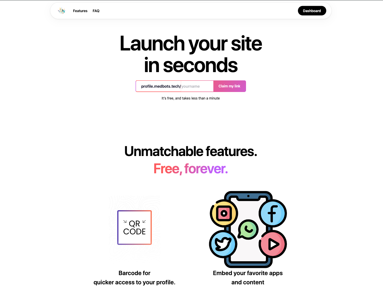 The main landing page showcasing the clean, modern design and key features
Responsive Design
Mobile Breakpoints
css
/* Extra small devices */
.xs\:text-14 {
    font-size: 14px;
}

/* Medium devices */
.md\:w-480p {
    width: 480px;
}

/* Large devices */
.lg\:w-840p {
    width: 840px;
}- Mobile-first approach
- Tailwind CSS utility classes
- Responsive typography
- Flexible layouts
Performance Optimizations
- Image Optimization
html
<img src="imgs/qr-theme.png" alt="themes" class="object-contain w-full h-full">- Lazy loading images
- Proper image sizing
- Alt tags for accessibility
- Optimized image formats
- CSS Organization
html
<link rel="stylesheet" href="assets/css/home.css">- External CSS file
- Minified stylesheets
- Efficient class naming
- Modular structure
Interactive Elements
1. Navigation Menu
html
<nav class="w-full h-full top-0 fixed bg-white z-40" style="display:none">
    <ul class="flex flex-col p-40 menu-items">
        <li class="py-24 br-bottom-grey">
            <a href="/features" class="text-20 font-bold block">Features</a>
        </li>
        <!-- More menu items -->
    </ul>
</nav>- Collapsible mobile menu
- Smooth transitions
- Clear navigation structure
2. Call-to-Action Buttons
html
<button type="submit" class="font-semibold text-white w-125p sm:w-auto rounded-r-md px-24 xs:px-0">
    Claim my link
</button>- High-contrast colors
- Hover effects
- Clear user feedback
- Mobile-friendly sizing
Best Practices
Accessibility
- Semantic HTML
- ARIA labels
- Keyboard navigation
- Color contrast
SEO
- Meta descriptions
- Open Graph tags
- Canonical URLs
- Structured data
Performance
- Minified assets
- Optimized images
- Efficient CSS
- Progressive loading
Related Components
- Registration system
- Login page
- Features page
- FAQ section